Early in my career, I discovered my passion for design systems—dynamic frameworks that provide teams with a unified set of standards to deliver consistent and cohesive product experiences.
At a glance
I led the creation of a comprehensive design system, transforming an inconsistent product into a cohesive, efficient framework that improved collaboration and accelerated delivery.
Role
Product Design - Design System Expert
Year
2023 - Now
A pivot worthy brand
Over a year ago, when I joined the team, I immediately recognized a critical challenge: there was no unified design system. There were inconsistencies, unclear patterns, and misaligned design principles in the product's interface.
Due to these issues, the design and development teams were in friction and delivery timelines were slowed down. Seeing the impact on efficiency and user experience, I built a comprehensive design system that continues to evolve today.
Research & Wireframes
Introduction
As a Product Design - Design System Expert at Rapyd, I took on the challenge of optimizing our design system to enhance collaboration and efficiency. Upon joining, I inherited an overbuilt yet under-documented Figma file that struggled to align with the front-end implementation.
I am established comprehensive documentation, introduced a structured critique and governance process to evolve the system on the design side, and initiated efforts with engineering to prioritize the design system as a shared responsibility between both teams.
By standardizing behaviors, patterns, and establishing a shared language, the design system not only improved collaboration with R&D but also reduced development time by 25%, enabling the team to deliver more efficiently and effectively.
Discovering the Pain Points
Laying the Groundwork for Transformation
The first step in building a successful design system is understanding the problems it aims to solve.
This phase involved a comprehensive audit of the existing product to identify inconsistencies, redundancies, and inefficiencies that hindered performance and user experience.
Auditing Designs: I cataloged all UI components and patterns across the product, revealing fragmented design elements that caused visual and functional inconsistencies.
Stakeholder Insights: Engaging with product managers, engineers, and designers helped uncover bottlenecks in workflows and miscommunications affecting project timelines.
User Feedback Analysis: By reviewing complaints and suggestions, I pinpointed how disjointed designs led to usability challenges, particularly in navigation and interactions.
This discovery phase provided a clear understanding of the gaps and set a strong foundation for designing a cohesive system that addressed these challenges.
To kickstart the project, I conducted a thorough audit of the product's design. This involved:
Cataloging existing UI components and patterns to identify redundancies and inconsistencies.
Interviewing stakeholders, including product managers, engineers, and designers, to understand pain points and workflow bottlenecks.
Reviewing user feedback to uncover usability issues stemming from inconsistent designs.
The findings were clear: the team lacked a shared language, and the scattered design practices often led to rework and miscommunication
The Process
Crafting the System
As a Product Design - Design System Expert at Rapyd, I took on the challenge of optimizing our design system to enhance collaboration and efficiency. Upon joining, I inherited an overbuilt yet under-documented Figma file that struggled to align with the front-end implementation.
I am established comprehensive documentation, introduced a structured critique and governance process to evolve the system on the design side, and initiated efforts with engineering to prioritize the design system as a shared responsibility between both teams.
Standardization
I began by defining the foundational principles of the design system. These included:
Core Design Tokens: Establishing a unified color palette, typography scale, and spacing system to ensure visual consistency.
Reusable Components: Designing modular, scalable UI components that could adapt across different use cases.
To maintain alignment, I documented guidelines for using each component, providing clarity on behavior, interactions, and states.
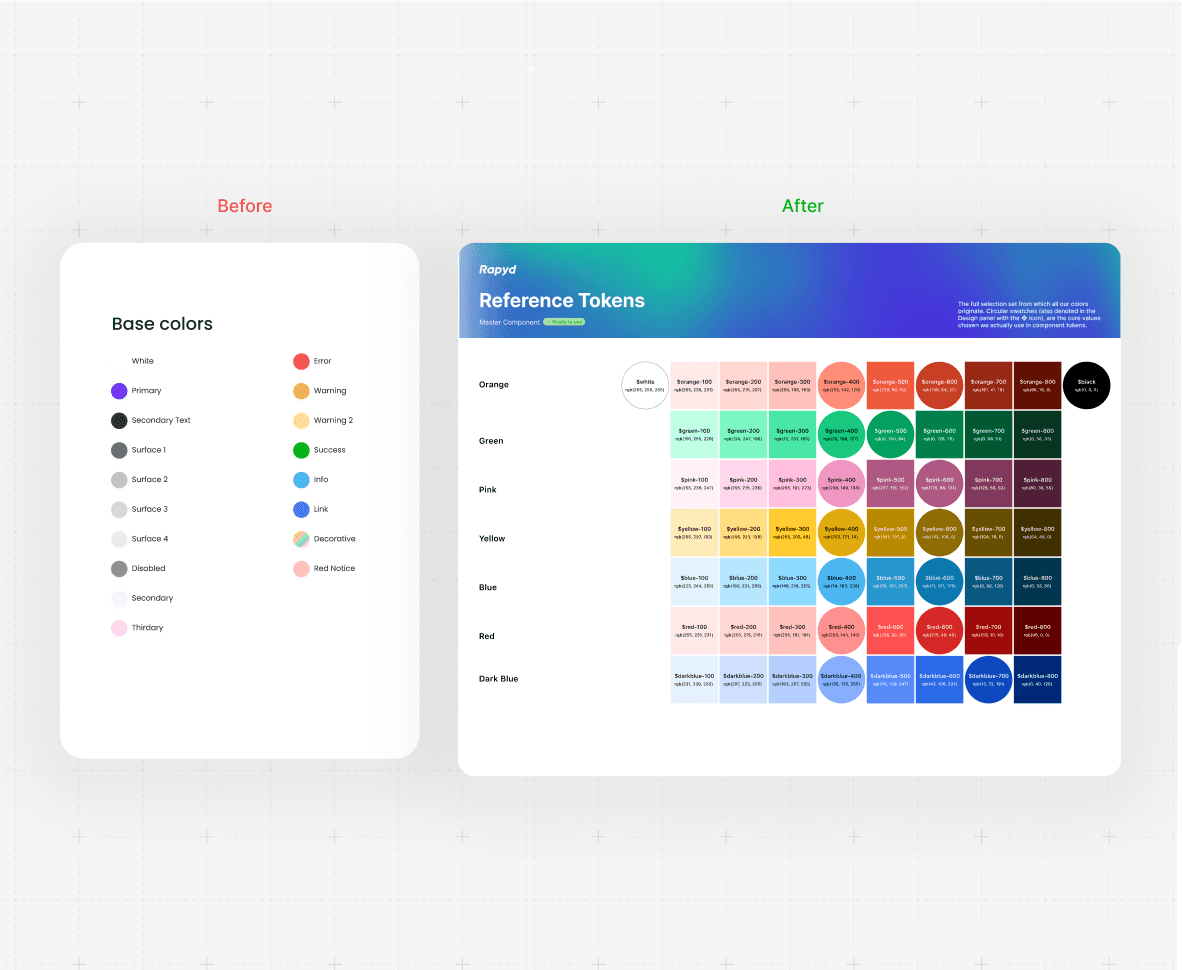
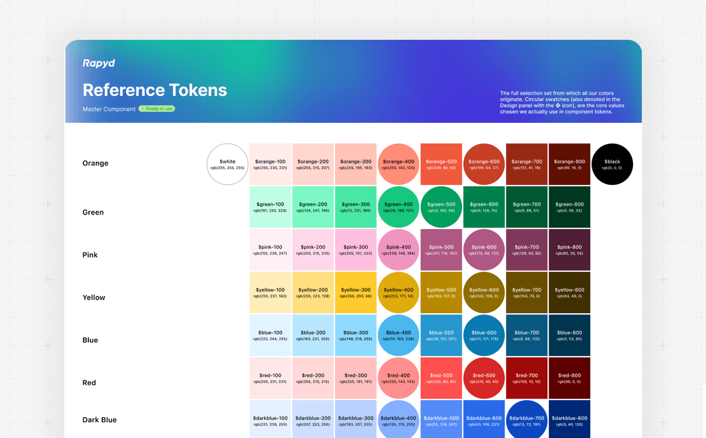
The reference palette is an exhaustive range of colors with values 0-100 that we can create with. It’s purpose is to define a rigorous, principles-based selection set from which all our colors originate.
Collaboration
Building the system required close collaboration with R&D. By working iteratively, we:
Conducted workshops to align on naming conventions, component usage, and design patterns.
Created a feedback loop where engineers could share insights from implementation challenges.
This partnership ensured the design system was not only visually consistent but also technically feasible and efficient to implement.
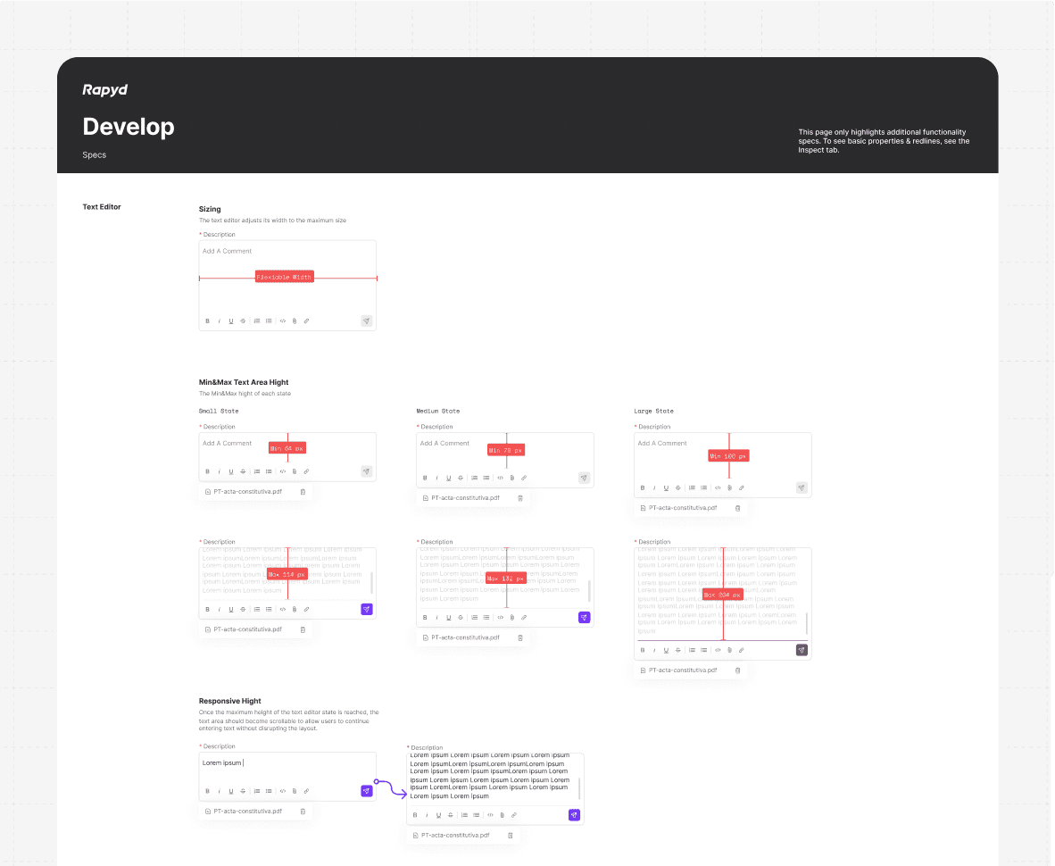
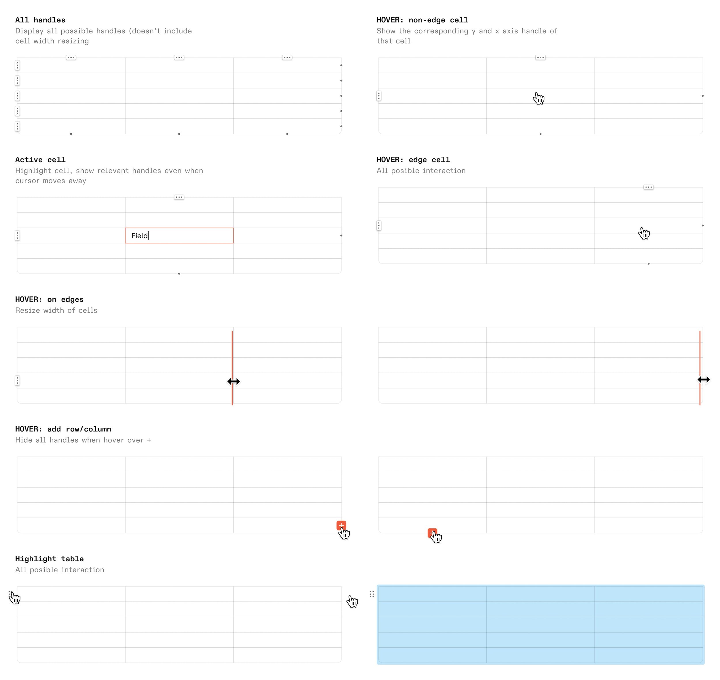
This page only highlights additional functionality specs. To see basic properties & redlines, see the Inspect tab.
Tooling & Implementation
leveraged Figma for design documentation and prototyping, and Storybook for interactive component libraries.
These tools empowered designers and developers to access the system easily and ensured seamless integration into the development workflow.
Audit and preparation
Laying the groundwork to scale
When I joined Rapyd, I inherited an overcomplicated and undocumented Figma file that struggled under broader team use, initially designed for just one person.
Most components lacked proper documentation, and where it existed, it was outdated and focused solely on immediate implementation for engineers. Over time, additional variants and options were added without updating the documentation, causing confusion about how and when to use certain properties.
The components themselves were overly complex and fragile. They lacked cascading functionality, making even small fixes costly and time-consuming. Introducing variations often meant breaking the component or adding to an already lengthy list of properties.
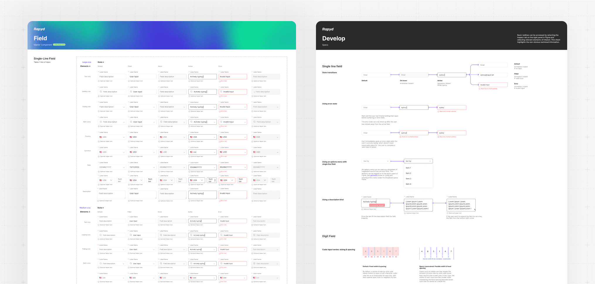
Most pages contained core components with multiple options bundled together in a large variant matrix.
Where documentation was available, it focused on guiding the component’s initial build but did not provide guidance for its ongoing use
Impact & Results
Quantifying Success and Transformation
We quickly noticed greater cohesion, fewer rogue components, and a faster pace of iterative, early-stage design work.
The governance process I implemented fostered collaboration among designers, providing early visibility into how the system was evolving across the product.
The introduction of a design system brought measurable improvements across multiple facets of the product lifecycle:
Streamlined Development:
By standardizing components and patterns, the system reduced redundancy and confusion during implementation. This led to a 25% decrease in development time, empowering the team to deliver features faster.
Enhanced Collaboration:
A shared language and detailed documentation bridged gaps between design and development teams, minimizing miscommunication and fostering better teamwork.Improved User Experience:
A cohesive design across the product created a seamless user journey, elevating usability and customer satisfaction while enhancing the product's perceived quality.
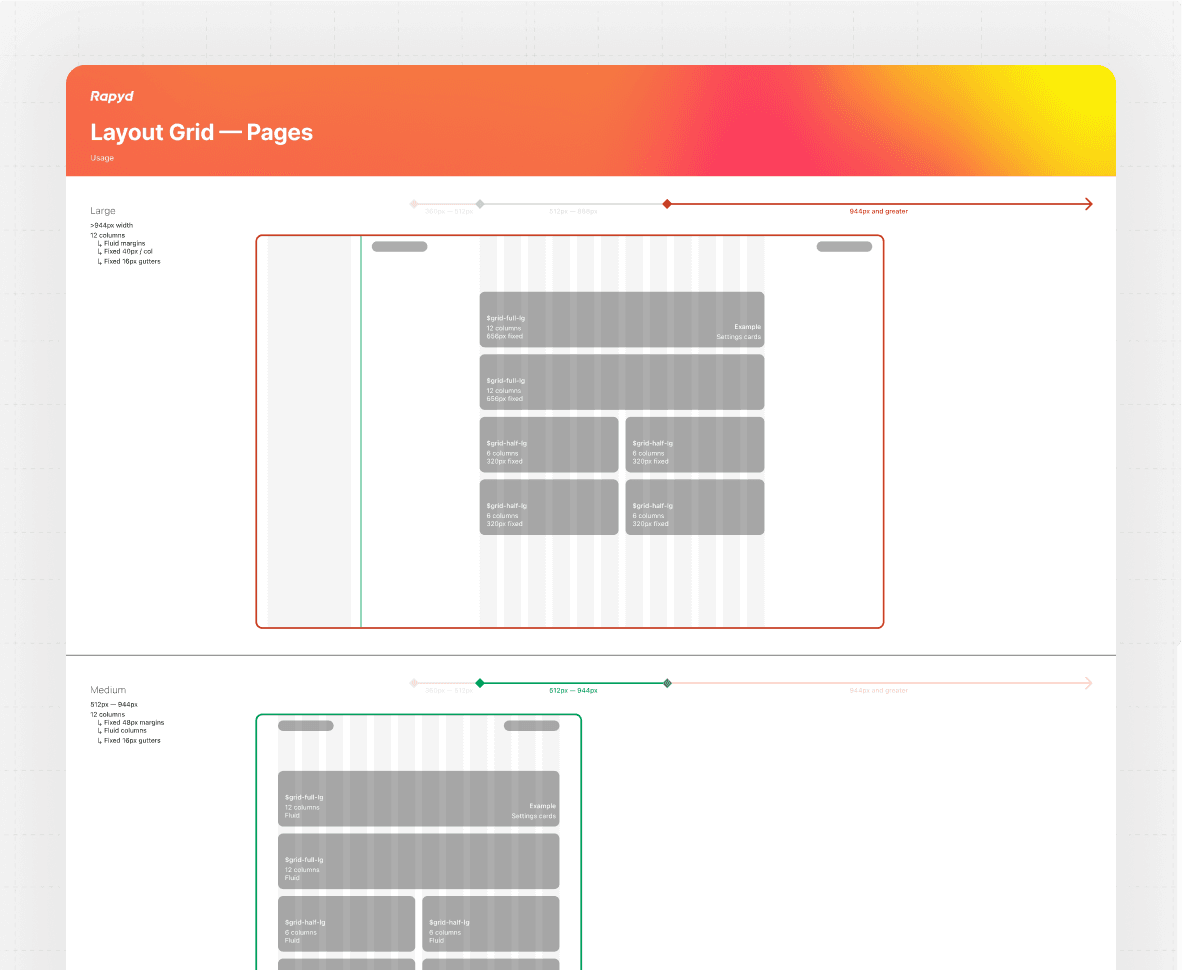
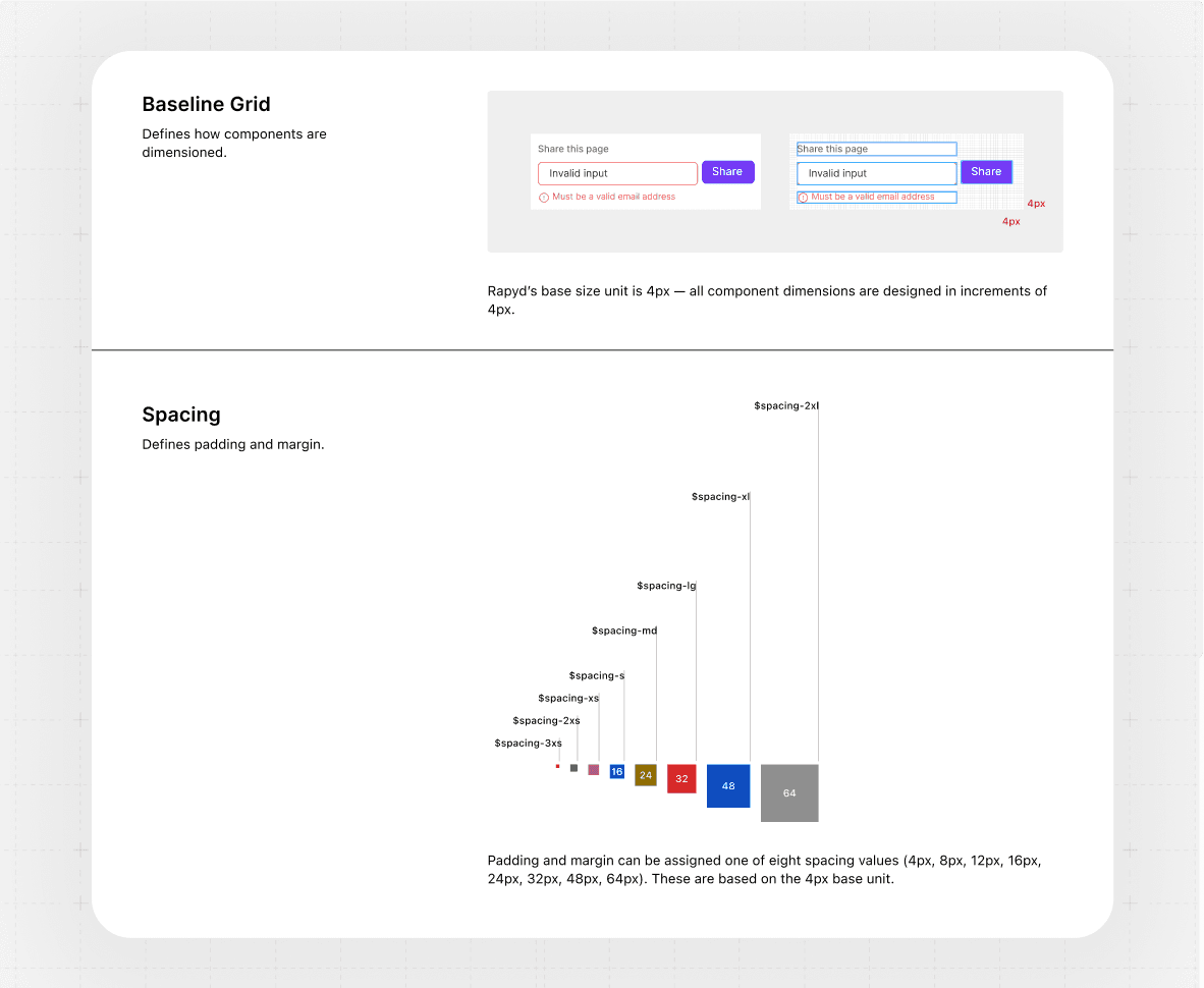
A layout grid with defined spacing ensures consistency, improves readability, and creates balanced designs across web, tablet, and mobile devices.
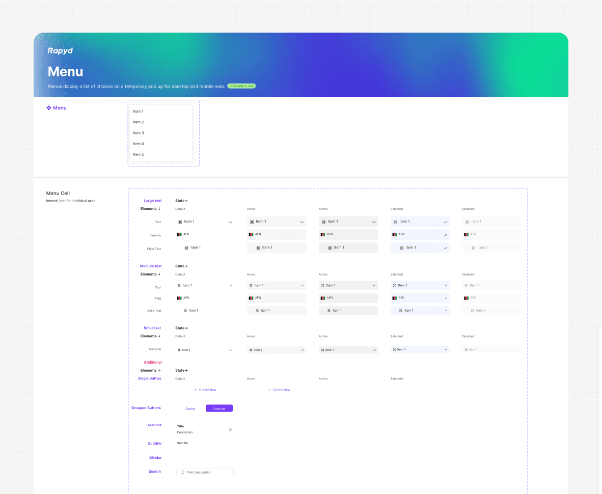
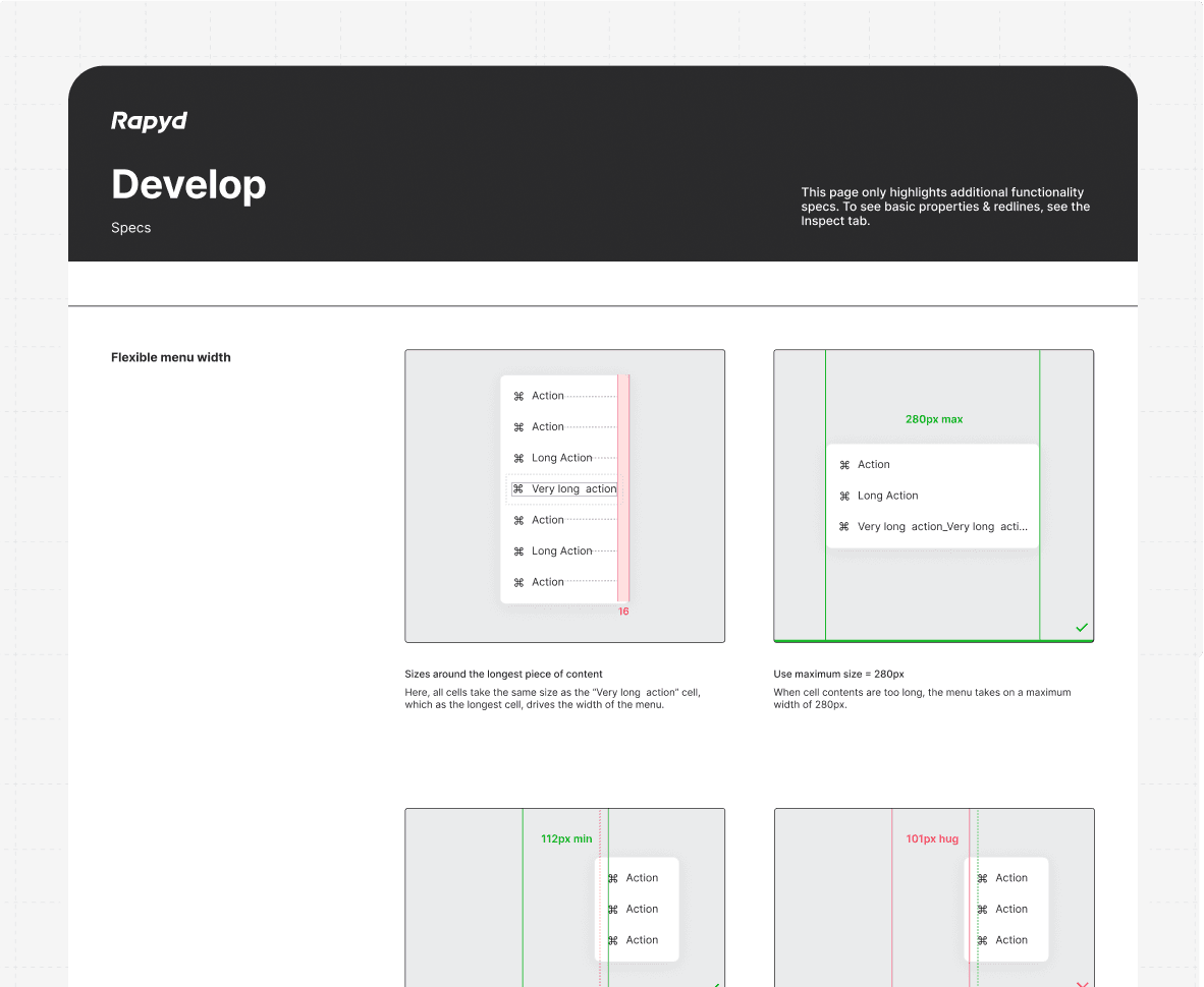
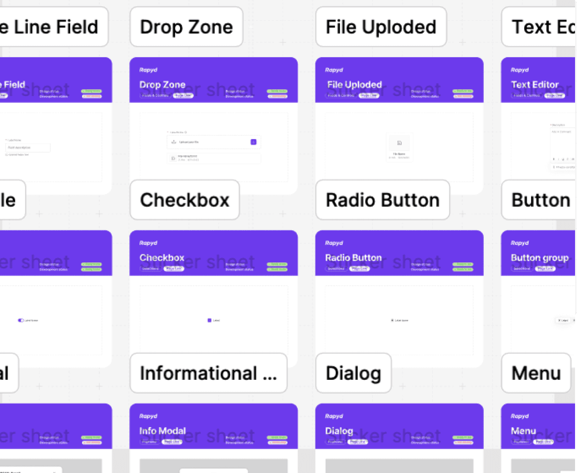
Menu component supports intuitive navigation with defined functionality, including dropdowns, keyboard accessibility, and hover/click states. It is fully customizable
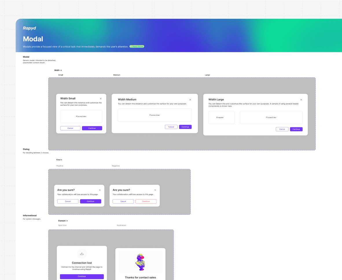
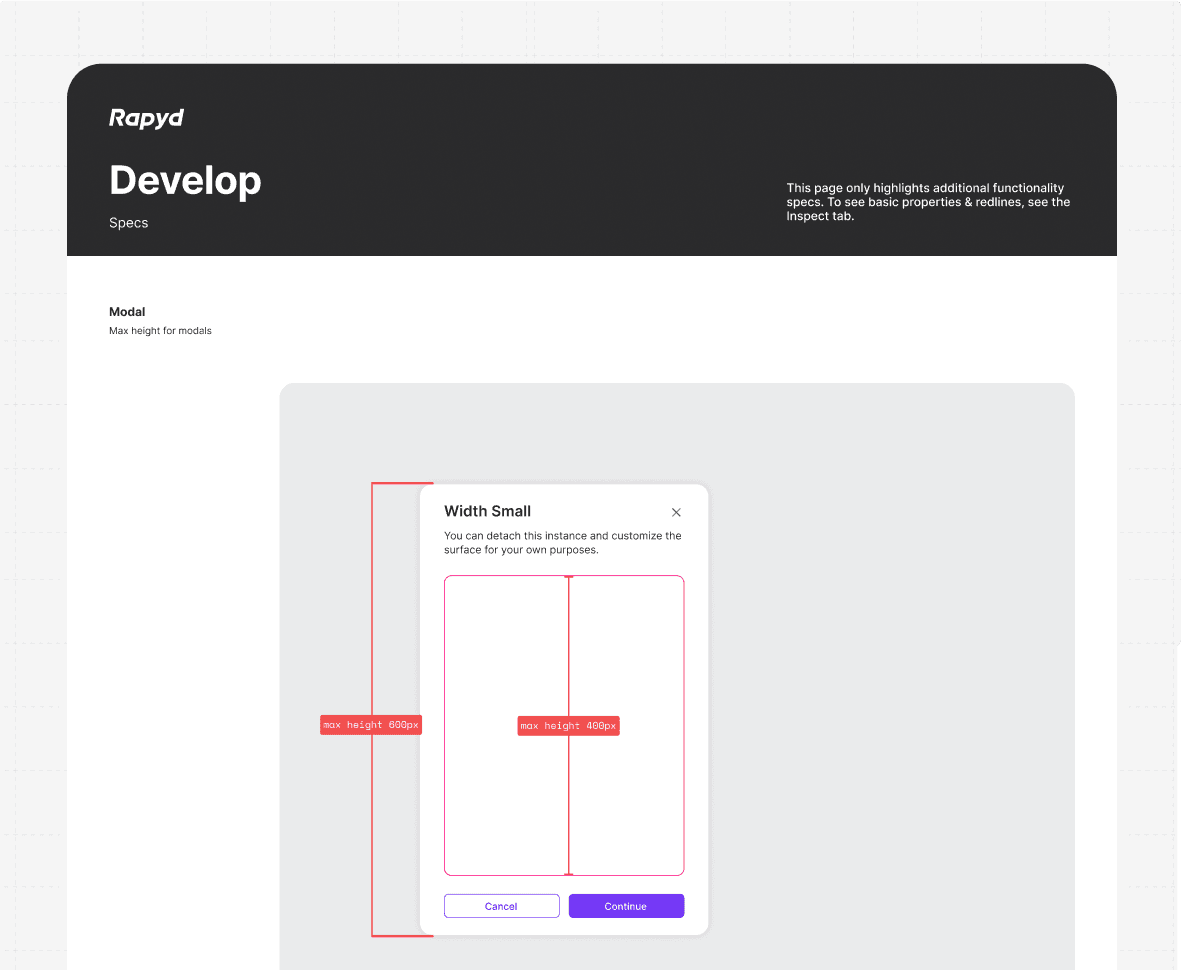
The modal component provides focused interaction, supporting features like customizable headers, footers, and dynamic content. For redlines and detailed specs, refer to the Inspect tab.

One of my biggest project was to redesign all modal components to align with the new designs. This ensured visual and functional consistency across the product, enhancing usability and creating a cohesive user experience
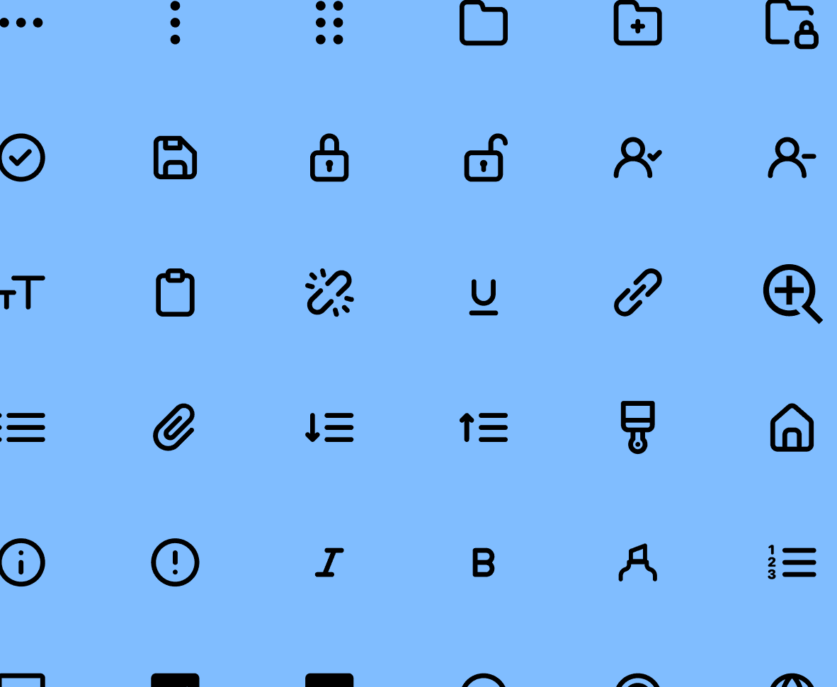

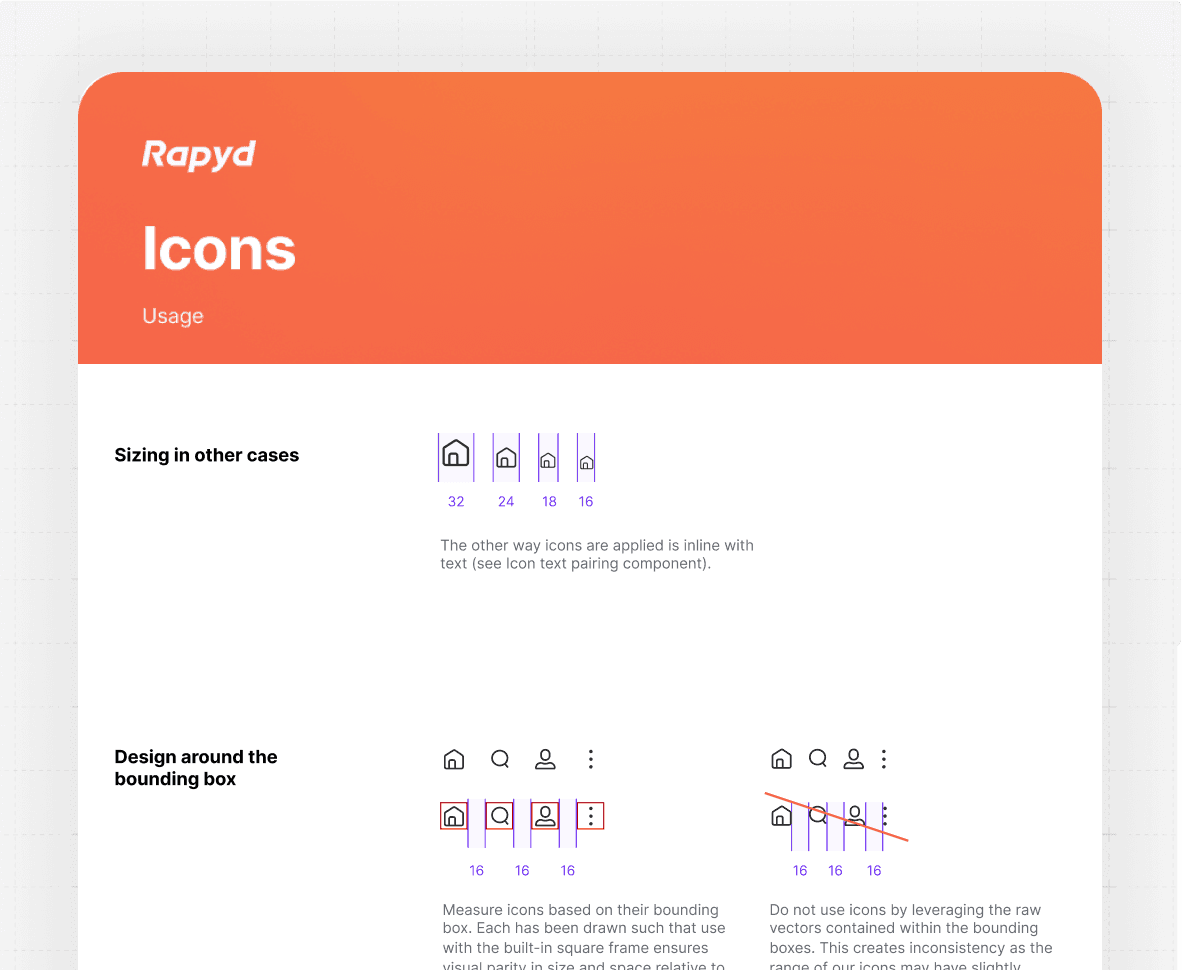
Icons align within a square bounding box for consistency; avoid using raw vectors to maintain uniformity.
This will hide itself!
Early in my career, I discovered my passion for design systems—dynamic frameworks that provide teams with a unified set of standards to deliver consistent and cohesive product experiences.

At a glance
I led the creation of a comprehensive design system, transforming an inconsistent product into a cohesive, efficient framework that improved collaboration and accelerated delivery.
Role
Product Design - Design System Expert
Year
2023 - Now

A pivot worthy brand
Over a year ago, when I joined the team, I immediately recognized a critical challenge: there was no unified design system. There were inconsistencies, unclear patterns, and misaligned design principles in the product's interface.
Due to these issues, the design and development teams were in friction and delivery timelines were slowed down. Seeing the impact on efficiency and user experience, I built a comprehensive design system that continues to evolve today.
At a Galance
Introduction
As a Product Design - Design System Expert at Rapyd, I took on the challenge of optimizing our design system to enhance collaboration and efficiency. Upon joining, I inherited an overbuilt yet under-documented Figma file that struggled to align with the front-end implementation.
I am established comprehensive documentation, introduced a structured critique and governance process to evolve the system on the design side, and initiated efforts with engineering to prioritize the design system as a shared responsibility between both teams.
By standardizing behaviors, patterns, and establishing a shared language, the design system not only improved collaboration with R&D but also reduced development time by 25%, enabling the team to deliver more efficiently and effectively.

Discovering the Pain Points
Laying the Groundwork for Transformation
The first step in building a successful design system is understanding the problems it aims to solve.
This phase involved a comprehensive audit of the existing product to identify inconsistencies, redundancies, and inefficiencies that hindered performance and user experience.
Auditing Designs: I cataloged all UI components and patterns across the product, revealing fragmented design elements that caused visual and functional inconsistencies.
Stakeholder Insights: Engaging with product managers, engineers, and designers helped uncover bottlenecks in workflows and miscommunications affecting project timelines.
User Feedback Analysis: By reviewing complaints and suggestions, I pinpointed how disjointed designs led to usability challenges, particularly in navigation and interactions.
This discovery phase provided a clear understanding of the gaps and set a strong foundation for designing a cohesive system that addressed these challenges.

To kickstart the project, I conducted a thorough audit of the product's design. This involved:
Cataloging existing UI components and patterns to identify redundancies and inconsistencies.
Interviewing stakeholders, including product managers, engineers, and designers, to understand pain points and workflow bottlenecks.
Reviewing user feedback to uncover usability issues stemming from inconsistent designs.
The findings were clear: the team lacked a shared language, and the scattered design practices often led to rework and miscommunication
The Process
Crafting the System
As a Product Design - Design System Expert at Rapyd, I took on the challenge of optimizing our design system to enhance collaboration and efficiency. Upon joining, I inherited an overbuilt yet under-documented Figma file that struggled to align with the front-end implementation.
I am established comprehensive documentation, introduced a structured critique and governance process to evolve the system on the design side, and initiated efforts with engineering to prioritize the design system as a shared responsibility between both teams.
Standardization
I began by defining the foundational principles of the design system. These included:
Core Design Tokens: Establishing a unified color palette, typography scale, and spacing system to ensure visual consistency.
Reusable Components: Designing modular, scalable UI components that could adapt across different use cases.
To maintain alignment, I documented guidelines for using each component, providing clarity on behavior, interactions, and states.

The reference palette is an exhaustive range of colors with values 0-100 that we can create with. It’s purpose is to define a rigorous, principles-based selection set from which all our colors originate.
Collaboration
Building the system required close collaboration with R&D. By working iteratively, we:
Conducted workshops to align on naming conventions, component usage, and design patterns.
Created a feedback loop where engineers could share insights from implementation challenges.
This partnership ensured the design system was not only visually consistent but also technically feasible and efficient to implement.

This page only highlights additional functionality specs. To see basic properties & redlines, see the Inspect tab.
Tooling & Implementation
leveraged Figma for design documentation and prototyping, and Storybook for interactive component libraries.
These tools empowered designers and developers to access the system easily and ensured seamless integration into the development workflow.

Audit and preparation
Laying the groundwork to scale
Intego Total Protection UI represents a significant milestone for the brand, debuting its new visual language. We created a UI that seamlessly integrates intuitive UX patterns with macOS-native components and interactive elements.
With such a playful, calming, and clean aesthetic, users can engage with their device security in a relaxed and effortless way.

Most pages contained core components with multiple options bundled together in a large variant matrix.
Where documentation was available, it focused on guiding the component’s initial build but did not provide guidance for its ongoing use
Impact & Results
Quantifying Success and Transformation
We quickly noticed greater cohesion, fewer rogue components, and a faster pace of iterative, early-stage design work. The governance process I implemented fostered collaboration among designers, providing early visibility into how the system was evolving across the product.
The introduction of a design system brought measurable improvements across multiple facets of the product lifecycle:
Streamlined Development:
By standardizing components and patterns, the system reduced redundancy and confusion during implementation. This led to a 25% decrease in development time, empowering the team to deliver features faster.
Enhanced Collaboration:
A shared language and detailed documentation bridged gaps between design and development teams, minimizing miscommunication and fostering better teamwork.Improved User Experience:
A cohesive design across the product created a seamless user journey, elevating usability and customer satisfaction while enhancing the product's perceived quality.


A layout grid with defined spacing ensures consistency, improves readability, and creates balanced designs across web, tablet, and mobile devices.


Menu component supports intuitive navigation with defined functionality, including dropdowns, keyboard accessibility, and hover/click states. It is fully customizable


The modal component provides focused interaction, supporting features like customizable headers, footers, and dynamic content. For redlines and detailed specs, refer to the Inspect tab.

One of my biggest project was to redesign all modal components to align with the new designs. This ensured visual and functional consistency across the product, enhancing usability and creating a cohesive user experience


Icons align within a square bounding box for consistency; avoid using raw vectors to maintain uniformity.
This will hide itself!
Early in my career, I discovered my passion for design systems—dynamic frameworks that provide teams with a unified set of standards to deliver consistent and cohesive product experiences.

At a glance
I led the creation of a comprehensive design system, transforming an inconsistent product into a cohesive, efficient framework that improved collaboration and accelerated delivery.
Role
Product Design - Design System Expert
Year
2023 - Now

A pivot worthy brand
Over a year ago, when I joined the team, I immediately recognized a critical challenge: there was no unified design system. There were inconsistencies, unclear patterns, and misaligned design principles in the product's interface.
Due to these issues, the design and development teams were in friction and delivery timelines were slowed down. Seeing the impact on efficiency and user experience, I built a comprehensive design system that continues to evolve today.
At a Galance
Introduction
As a Product Design - Design System Expert at Rapyd, I took on the challenge of optimizing our design system to enhance collaboration and efficiency. Upon joining, I inherited an overbuilt yet under-documented Figma file that struggled to align with the front-end implementation.
I am established comprehensive documentation, introduced a structured critique and governance process to evolve the system on the design side, and initiated efforts with engineering to prioritize the design system as a shared responsibility between both teams.
By standardizing behaviors, patterns, and establishing a shared language, the design system not only improved collaboration with R&D but also reduced development time by 25%, enabling the team to deliver more efficiently and effectively.

Discovering the Pain Points
Laying the Groundwork for Transformation
The first step in building a successful design system is understanding the problems it aims to solve.
This phase involved a comprehensive audit of the existing product to identify inconsistencies, redundancies, and inefficiencies that hindered performance and user experience.
Auditing Designs: I cataloged all UI components and patterns across the product, revealing fragmented design elements that caused visual and functional inconsistencies.
Stakeholder Insights: Engaging with product managers, engineers, and designers helped uncover bottlenecks in workflows and miscommunications affecting project timelines.
User Feedback Analysis: By reviewing complaints and suggestions, I pinpointed how disjointed designs led to usability challenges, particularly in navigation and interactions.
This discovery phase provided a clear understanding of the gaps and set a strong foundation for designing a cohesive system that addressed these challenges.

To kickstart the project, I conducted a thorough audit of the product's design. This involved:
Cataloging existing UI components and patterns to identify redundancies and inconsistencies.
Interviewing stakeholders, including product managers, engineers, and designers, to understand pain points and workflow bottlenecks.
Reviewing user feedback to uncover usability issues stemming from inconsistent designs.
The findings were clear: the team lacked a shared language, and the scattered design practices often led to rework and miscommunication
The Process
Crafting the System
As a Product Design - Design System Expert at Rapyd, I took on the challenge of optimizing our design system to enhance collaboration and efficiency. Upon joining, I inherited an overbuilt yet under-documented Figma file that struggled to align with the front-end implementation.
I am established comprehensive documentation, introduced a structured critique and governance process to evolve the system on the design side, and initiated efforts with engineering to prioritize the design system as a shared responsibility between both teams.
Standardization
I began by defining the foundational principles of the design system. These included:
Core Design Tokens: Establishing a unified color palette, typography scale, and spacing system to ensure visual consistency.
Reusable Components: Designing modular, scalable UI components that could adapt across different use cases.
To maintain alignment, I documented guidelines for using each component, providing clarity on behavior, interactions, and states.

The reference palette is an exhaustive range of colors with values 0-100 that we can create with. It’s purpose is to define a rigorous, principles-based selection set from which all our colors originate.
Collaboration
Building the system required close collaboration with R&D. By working iteratively, we:
Conducted workshops to align on naming conventions, component usage, and design patterns.
Created a feedback loop where engineers could share insights from implementation challenges.
This partnership ensured the design system was not only visually consistent but also technically feasible and efficient to implement.

This page only highlights additional functionality specs. To see basic properties & redlines, see the Inspect tab.
Tooling & Implementation
leveraged Figma for design documentation and prototyping, and Storybook for interactive component libraries.
These tools empowered designers and developers to access the system easily and ensured seamless integration into the development workflow.

Audit and preparation
Laying the groundwork to scale
When I joined Rapyd, I inherited an overcomplicated and undocumented Figma file that struggled under broader team use, initially designed for just one person.
Most components lacked proper documentation, and where it existed, it was outdated and focused solely on immediate implementation for engineers. Over time, additional variants and options were added without updating the documentation, causing confusion about how and when to use certain properties.
The components themselves were overly complex and fragile. They lacked cascading functionality, making even small fixes costly and time-consuming. Introducing variations often meant breaking the component or adding to an already lengthy list of properties.

Most pages contained core components with multiple options bundled together in a large variant matrix.
Where documentation was available, it focused on guiding the component’s initial build but did not provide guidance for its ongoing use
Impact & Results
Quantifying Success and Transformation
We quickly noticed greater cohesion, fewer rogue components, and a faster pace of iterative, early-stage design work.
The governance process I implemented fostered collaboration among designers, providing early visibility into how the system was evolving across the product.
The introduction of a design system brought measurable improvements across multiple facets of the product lifecycle:
Streamlined Development:
By standardizing components and patterns, the system reduced redundancy and confusion during implementation. This led to a 25% decrease in development time, empowering the team to deliver features faster.
Enhanced Collaboration:
A shared language and detailed documentation bridged gaps between design and development teams, minimizing miscommunication and fostering better teamwork.Improved User Experience:
A cohesive design across the product created a seamless user journey, elevating usability and customer satisfaction while enhancing the product's perceived quality.


A layout grid with defined spacing ensures consistency, improves readability, and creates balanced designs across web, tablet, and mobile devices.


Menu component supports intuitive navigation with defined functionality, including dropdowns, keyboard accessibility, and hover/click states. It is fully customizable


The modal component provides focused interaction, supporting features like customizable headers, footers, and dynamic content. For redlines and detailed specs, refer to the Inspect tab.

One of my biggest project was to redesign all modal components to align with the new designs. This ensured visual and functional consistency across the product, enhancing usability and creating a cohesive user experience


Icons align within a square bounding box for consistency; avoid using raw vectors to maintain uniformity.
This will hide itself!